


eCommerce Website Design
Process & Results
eCommerce Website Design: Conversion Focused
1. Key Design Principles
| Principle | Focus | Execution |
| Usability & Intuition | Users must be able to find, evaluate, and purchase products with minimal effort. | Clear navigation, strong internal search, simple checkout process, visible calls-to-action (CTAs). |
| Trust & Security | Buyers need assurance that their payment and data are safe. | Prominent display of security badges (SSL, payment logos), clear return/privacy policies, and social proof. |
| High-Quality Visuals | Since customers can’t physically touch the product, visuals must be excellent. | Large, professional product photos; 360-degree views; product videos; lifestyle shots. |
| Mobile-First Design | The majority of online shoppers now browse and purchase on mobile devices. | Optimized touch targets, fast loading speed, mobile-friendly menus, and simple forms. |
2. Essential Page Structures & Features
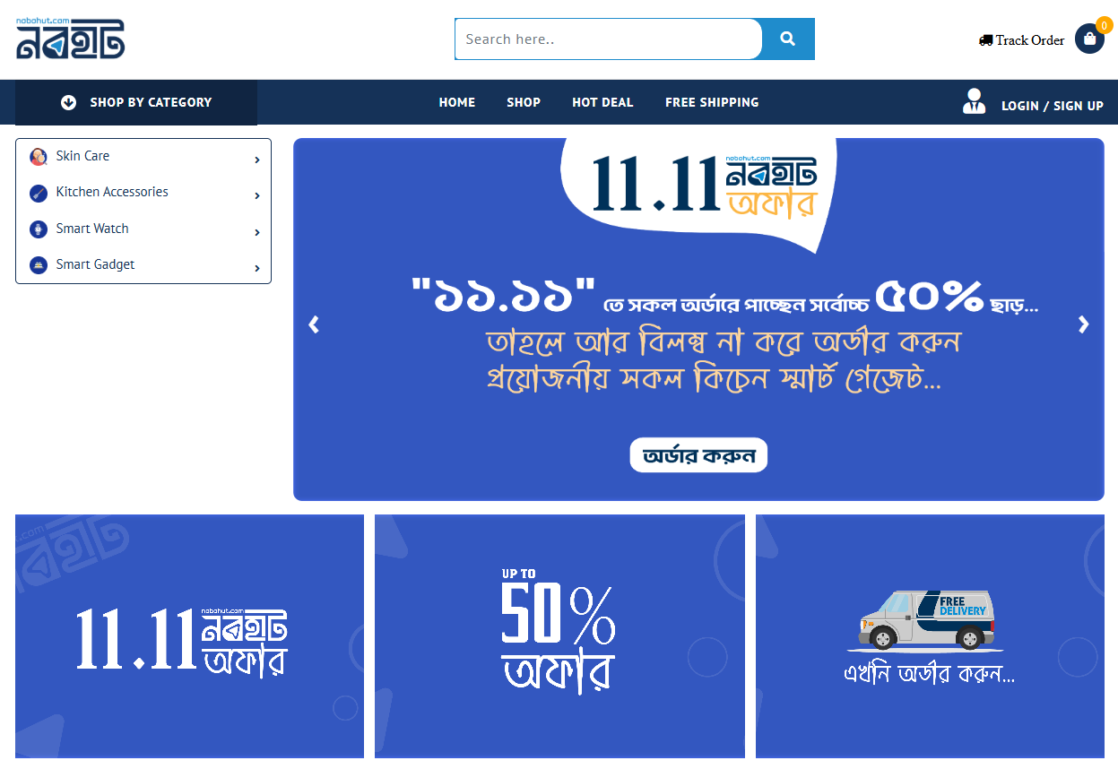
A. Homepage
Hero Section: High-impact visual (slider/video) showcasing the current promotion, new arrivals, or best-selling collections.
Trust Signals: Visible customer reviews, press mentions, or security badges.
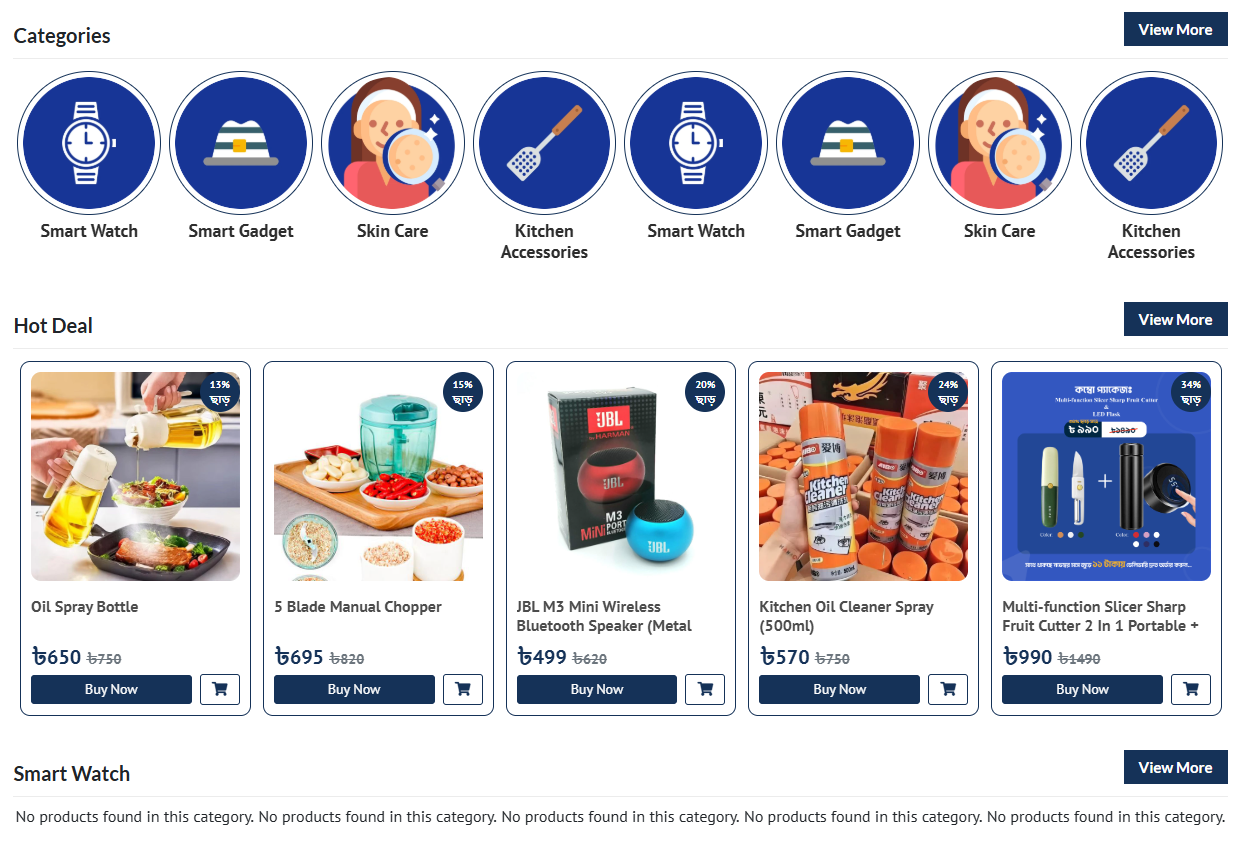
Clear Categories: Visual links to major product categories to guide shoppers.
Featured Products/Bestsellers: Immediately presenting high-demand items.
Email Signup Pop-up/Bar: Offer a discount code for subscription.
B. Product Listing Page (PLP / Category Page)
Powerful Filters & Sorting: Essential for large catalogs (e.g., filter by price, size, color, rating, brand).
Product Cards: Clean design showing the image, name, price, rating, and a quick “Add to Cart” option or badge (e.g., “Sold Out,” “New”).
Breadcrumbs: Clear navigation trail (e.g., Home > Clothing > Women’s Tops) to orient the user.
C. Product Detail Page (PDP)
This is the most critical conversion page.
High-Resolution Media: Multiple images, zoom functionality, product videos.
Clear Pricing & Availability: Price, any sale discounts, and stock status must be prominent.
“Add to Cart” CTA: Large, distinct button with good color contrast.
Detailed Description: Focus on benefits, features, materials, and care instructions.
Social Proof: Customer ratings, reviews (with photos if possible), and Q&A sections.
Shipping & Returns Info: Quick links or accordions summarizing policies.
Related Products/Upsells: Suggestions to increase Average Order Value (AOV).
D. Shopping Cart & Checkout Process
Persistent Cart Icon: Always visible, showing the item count and often the total value.
Minimalistic Checkout: Guest checkout must be an option.
Single-Page or Linear Multi-Step Checkout: Fewer steps, less clutter, and visible progress bar to reduce abandonment.
Security Reassurance: Security badges visible near the payment entry field.
Shipping Costs: Clearly displayed before the final payment stage.
3. Technical and SEO Considerations
Site Speed: Crucial. Optimize images and use fast hosting.
Structured Data: Use schema markup (especially for products) to enhance search results (e.g., showing price and rating directly in Google).
Clear URLs: Simple, descriptive, and consistent URL structure.
4. Key Design Tools
Color Palette: Use colors that evoke desired emotion (e.g., red for urgency, green for health/eco, blue for trust). Ensure the primary CTA color stands out.
Search Bar: Large, accessible, and features predictive text (auto-complete).