


Banner Design for Architect
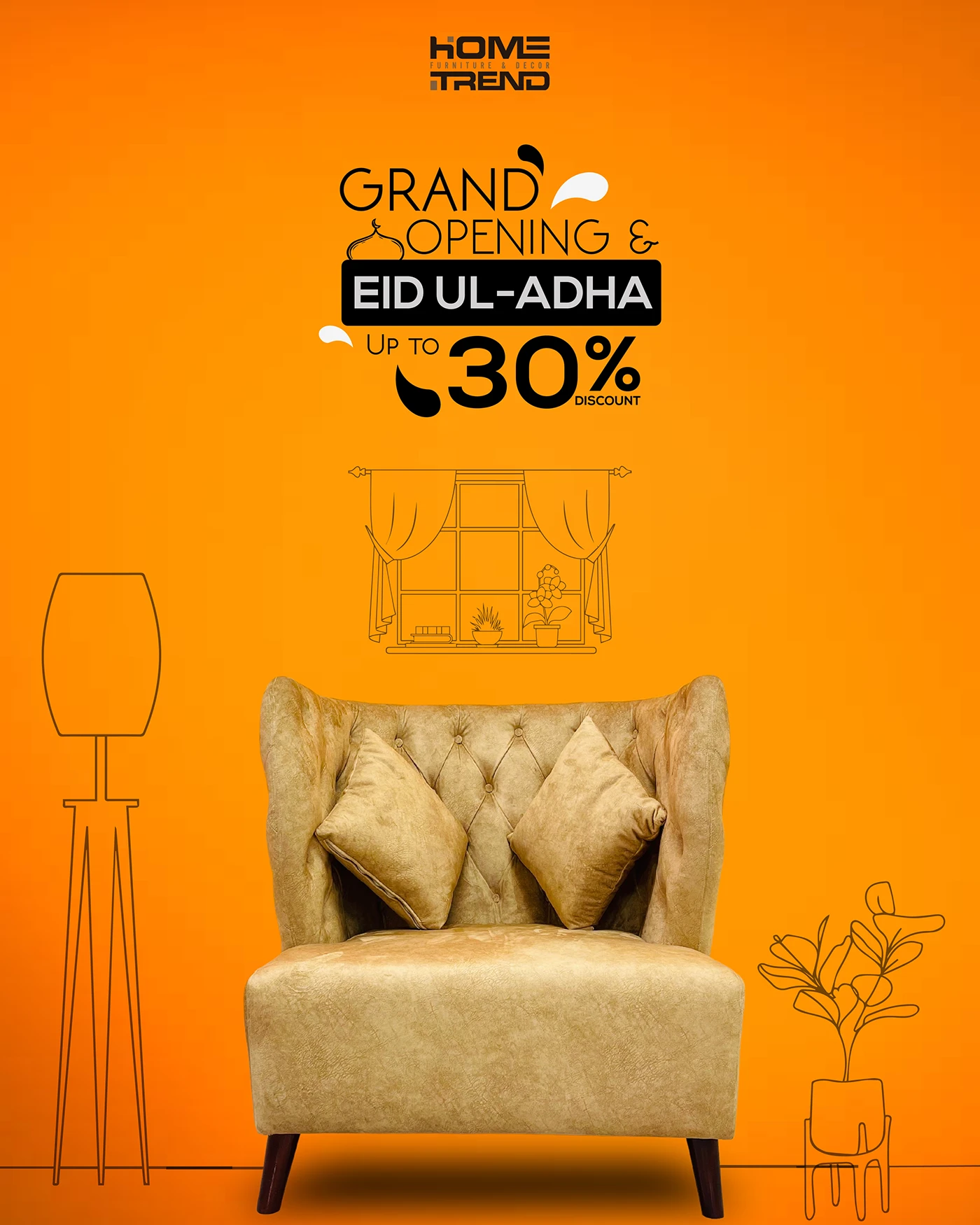
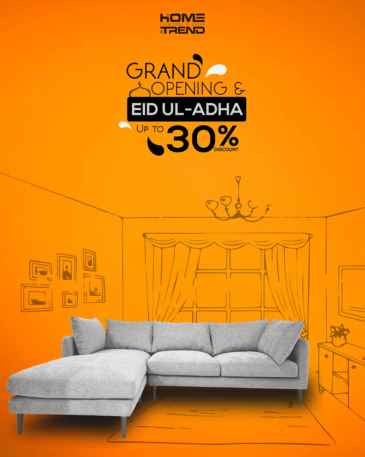
Poster Design for Home Trend: Key Elements & Considerations
1. The Core Message: What’s the “Trend”?
Before designing, define the specific trend you want to highlight. Is it:
Minimalist Nordic? (Clean lines, light wood, neutral colors)
Boho Chic? (Rattan, textiles, plants, eclectic mix)
Industrial Loft? (Exposed brick, metal, concrete)
Sustainable Living? (Natural materials, upcycling, energy efficiency)
Smart Home Tech? (Integrated devices, sleek interfaces)
Color of the Year? (Focus on a specific palette)
The poster needs to convey this trend visually at a glance.
2. Visuals: The Hero of the Poster
High-Quality Photography/Rendering: This is paramount.
Focus: A stunning image of a room (living room, kitchen, bedroom) that perfectly embodies the trend.
Composition: Well-composed, clean, and inspiring. Use professional-grade images.
Lighting: Natural, inviting light is often best.
Styling: Every detail in the photo should reinforce the trend.
Alternatives: Mood boards or collages if showcasing multiple facets of a trend.
Illustrations/Graphics (if applicable): If the trend is more conceptual (e.g., sustainable living), abstract illustrations or clean icons can support the message.
3. Typography: Legibility & Style
Headline: The main trend name (e.g., “Minimalist Living,” “Urban Jungle”).
Font Choice: Modern, clean, sans-serif fonts often work best (e.g., Montserrat, Lato, Open Sans, Helvetica Neue) for a contemporary feel. A sophisticated serif can also work for a more classic or luxurious trend.
Size & Weight: Large and bold for impact.
Sub-Headline/Descriptive Text: A brief, enticing sentence or two about the trend.
Font Choice: A highly readable font, complementing the headline.
Size: Smaller than the headline but still easily legible from a distance.
Call to Action (CTA) / Details:
Examples: “Discover More at [Website],” “Visit Our Showroom,” “Explore the Collection.”
Contact Info: Website, social media handles, QR code.
Placement: Clear and concise, often at the bottom.
4. Color Palette: Setting the Mood
Reflect the Trend:
Minimalist: Neutrals (whites, grays, beiges) with subtle natural accents.
Boho: Earthy tones, warm whites, terracotta, deep greens.
Industrial: Grays, blacks, metallics, deep browns.
Brand Consistency: If for a specific company, use brand colors, but adapt them to suit the trend’s aesthetic.
Contrast: Ensure text stands out clearly against the background image or color blocks.
5. Layout & Composition: Harmony & Balance
Clean & Uncluttered: Avoid visual noise. Let the main image and headline be the stars.
Hierarchy: Guide the viewer’s eye from the main image to the headline, then the sub-text, and finally the CTA.
White Space (or “Breathing Room”): Essential for a sophisticated and modern look. It prevents the poster from feeling cramped.
Grids: Using a grid system can help create balance and a professional appearance.
Focal Point: The primary image should immediately grab attention.
6. Branding Elements
Your Logo: Subtle but present. Often in a corner, not competing with the main trend visuals.
Event/Company Name: If the poster is for an event or a specific store.